Burning and Dodging

While Burning and Dodging are listed as tools in most photo editing software, they are digital versions of techniques originally developed by darkroom photographers years ago.

Burning is a trick for getting more detail out of a section of a picture. The photographer makes his print normally, and then masks off a large section of the print, usually with his hands. Then, with the light blocked, he adds a bit more exposure time to the print, so that the area that wasn’t masked gets more exposure. Dodging, on the other hand, involves using a small piece of paper or cardboard to block the light from a section of the photograph.

Burning, then, means adding extra exposure to some element of the picture, while dodging is less exposure. In general, this is different from the Brightness of a picture because brightness is applied to the entire picture, while burning and dodging are only applied to areas of the picture.

Photoshop, as an example, offers tools for Burning and Dodging. You can adjust the size of the “brush” and apply it to any part of the image, and the program will lighten or darken the area, just like a classic burn or dodge would have.

Both techniques are used for “balancing out” a picture. For example, if a landscape or cityscape turns out perfectly, but the sky behind it is overexposed (looking like a big white blob rather than the normal blue and white of sky and clouds), then dodging the sky will reduce the exposure, and hopefully bring the color back down to a normal level. If the sky exposed in the perfect shade of blue, but the windows are too dark to stand out from the buildings, then burning the windows would help to expose them better, bringing out more detail and clarity.

Brightness and Contrast

In photography, exposure is controlled by a variety of things–the size of the lens opening, the film speed, and the duration the lens remains open taking the picture. In digital photo editing, we can adjust exposure further, with the Brightness and Contrast controls.

Brightness, as the name implies, is the amount of light in the picture. The longer the lens was open and the wider the lens aperture, the brighter the resulting picture will be. Every photo editing program will have a Brightness control. Changing the brightness setting will adjust the colors of the pictures as if the photo was taken with a wider or narrower aperture.

However, increasing the brightness can cause the picture to look washed out. This is where Contrast comes in. Contrast is the range of dark and light in the picture–the spectrum between the darkest and the brightest regions of the picture. Changing the contrast will make the brights brighter and the darks darker, which will counter-balance the changes made by the Brightness control. Brightness and contrast are generally used in tandem in most photo editing projects.

In most projects, it’s rare to have a photo that needs overall brightness and contrast adjustments. What’s more common is to have a picture that needs adjustments to small areas. For example, a dark cityscape against a bright blue sky, or a portrait with sunlight behind the subject, would likely be ruined by changing the overall brightness and contrast. These pictures need smaller, focused adjustments. In the old darkroom days, the only choice the photographer had was to dodge or burn. With modern photo editing programs, however, he can use a Lasso selection set, and then apply Burn, Dodge, Brightness, Contrast, or even Levels and Curves adjustments, to only those parts of the picture that really need it.

Blurring the Background

The best Wildlife photography will always show a crystal-clear animal against a blurry background. This is done by using just the right combination of lens, aperture, and shutter speed, and really helps to make the subject stand out. If a background of branches and leaves were as sharply focused as the bird in the foreground, it would be very easy to lose the bird in the background “noise.”

You can use photo editing techniques to achieve the same effect.

Load your picture into your favorite photo editing program. Using a selection tool like a “Lasso,” select the foreground image, the “animal” that has to be set off from the “leaves and branches.” Once it’s selected, “Invert” the selection. Most photo editing programs have this option. In effect, it means “swap the selected areas for the unselected ones.” By inverting, you’ll select only the background of your image. If your program has the feature, you might also consider Feathering your selection. This helps to break up the outline of the selection, so that it doesn’t have such a sharp edge to it.

Once the background is highlighted, use a tool called Gaussian Blur. This is a specific type of blurring routine designed to imitate the blurring that happens in traditional photography. Don’t be afraid to experiment with the settings, but remember that a little bit of blur–leaving the background out of focus, but recognizable–is better than a lot.

A related photo technique is called Panning. Focus on a moving object, like a racecar, and keep the camera pointed at that object as it goes by. Done properly, the racecar will be in focus, while the crowd behind it will be blurred. This kind of blur is called Motion blur, or sometimes Radial blur. Using Radial instead of Gaussian will make your subject appear to be racing past the background.

The Importance of ID Cards

The Importance of ID Cards in Elementary and Middle Schools: Plastic vs. Laminated Paper

In an age where security concerns are paramount, the use of identification (ID) cards in schools has gained significant traction. Beyond just a means of identification, these cards serve multiple purposes, from ensuring safety to streamlining administrative processes. When it comes to materials for these cards, two types stand out: plastic and laminated paper. Let’s delve into the pros and cons of each.


1. Plastic ID Cards

Pros:

  • Durability: Plastic ID cards are robust and less prone to wear and tear. They can withstand daily use, handling, and even occasional spills or exposure to moisture without deteriorating.
  • Professional Appearance: Plastic cards offer a sleek, modern appearance. The print quality on plastic is often sharper and more vibrant, making it easier to distinguish details and photos.
  • Longevity: Due to their durability, plastic ID cards typically have a longer lifespan than laminated paper ones. This means fewer replacements and reduced costs in the long run.

Cons:

  • Cost: Plastic ID cards tend to be more expensive than their laminated counterparts. The initial investment can be a deterrent for schools operating on tight budgets.

2. Laminated Paper ID Cards

Pros:

  • Affordability: Laminated paper ID cards are cost-effective, making them an attractive option for schools with budget constraints or those requiring frequent replacements.
  • Ease of Production: With readily available laminating machines, schools can produce laminated IDs in-house, reducing lead times and ensuring quick replacements when needed.

Cons:

  • Vulnerability: Laminated paper is susceptible to wear, tear, and damage. Cards can easily bend, tear, or get damaged by liquids, compromising their usability and longevity.

Conclusion

Both plastic and laminated paper ID cards offer unique advantages and drawbacks. While plastic provides durability, laminated paper stands out for its affordability. Ultimately, the choice between the two depends on a school’s specific needs, and budget considerations. Regardless of the material chosen, the primary goal remains consistent: ensuring the safety and security of students and staff while maintaining efficient administrative processes.

The Portrait Package Magazine

A Comprehensive Keepsake for Every Occasion

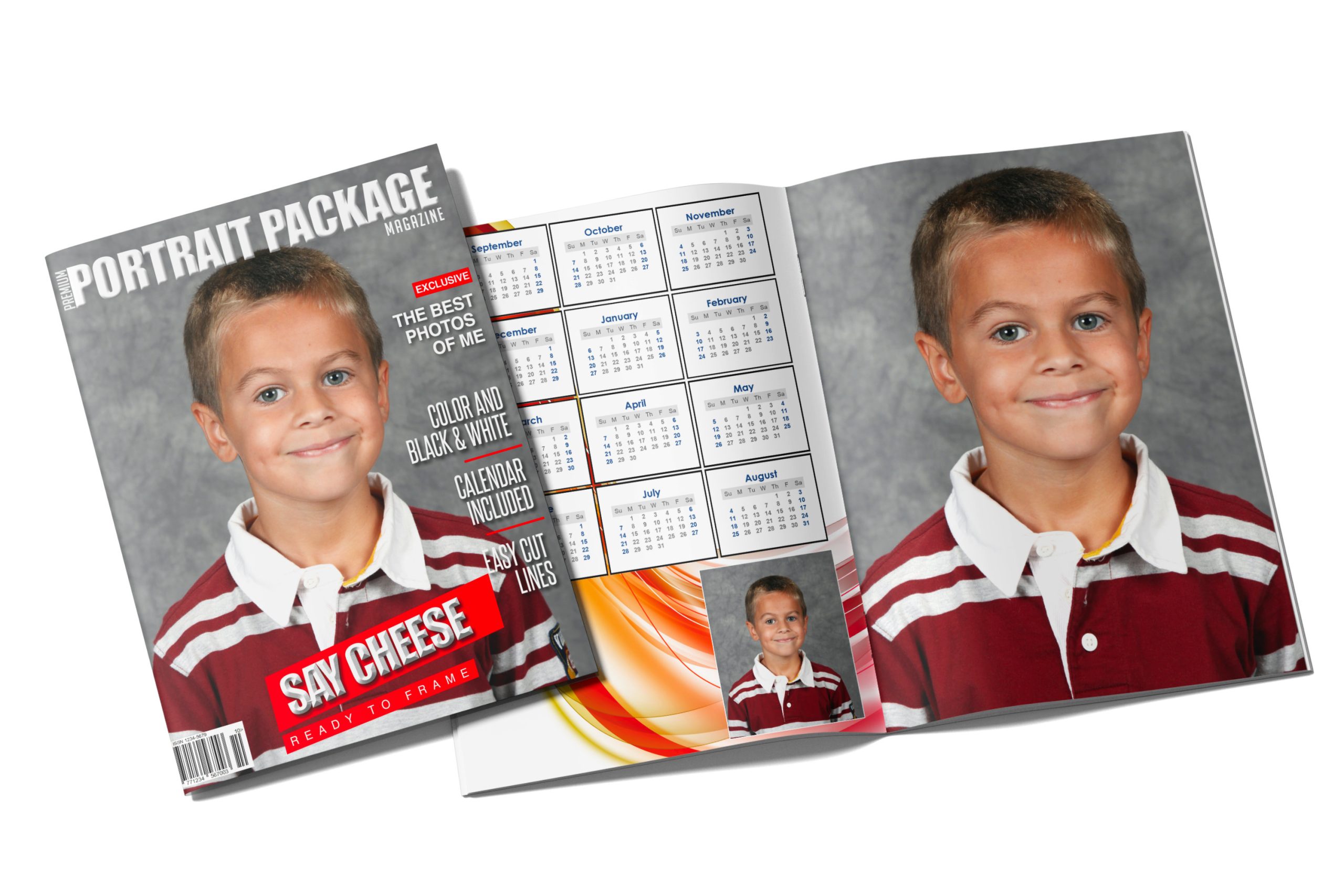
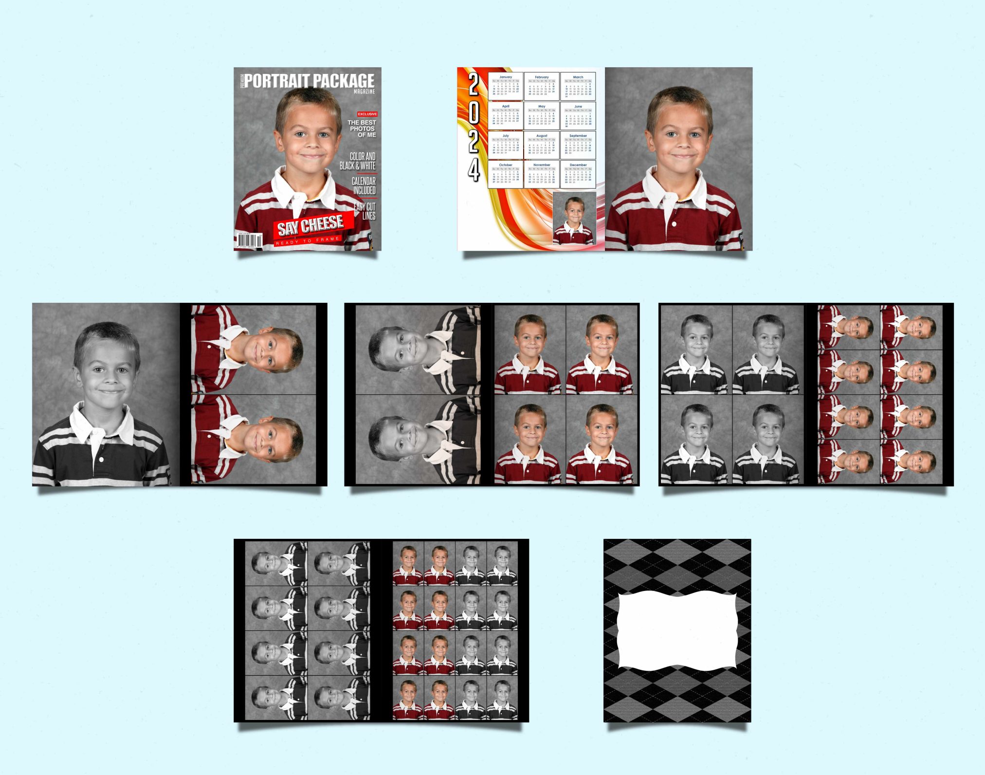
In today’s digital era, photographs have become more than just snapshots; they’re cherished memories, timeless keepsakes that capture moments we hold dear. Recognizing the profound value of these mementos, the Portrait Package Magazine emerges as an all-encompassing offering designed to encapsulate memories in the most exquisite manner for a low price of $3.75 for 12 sides.

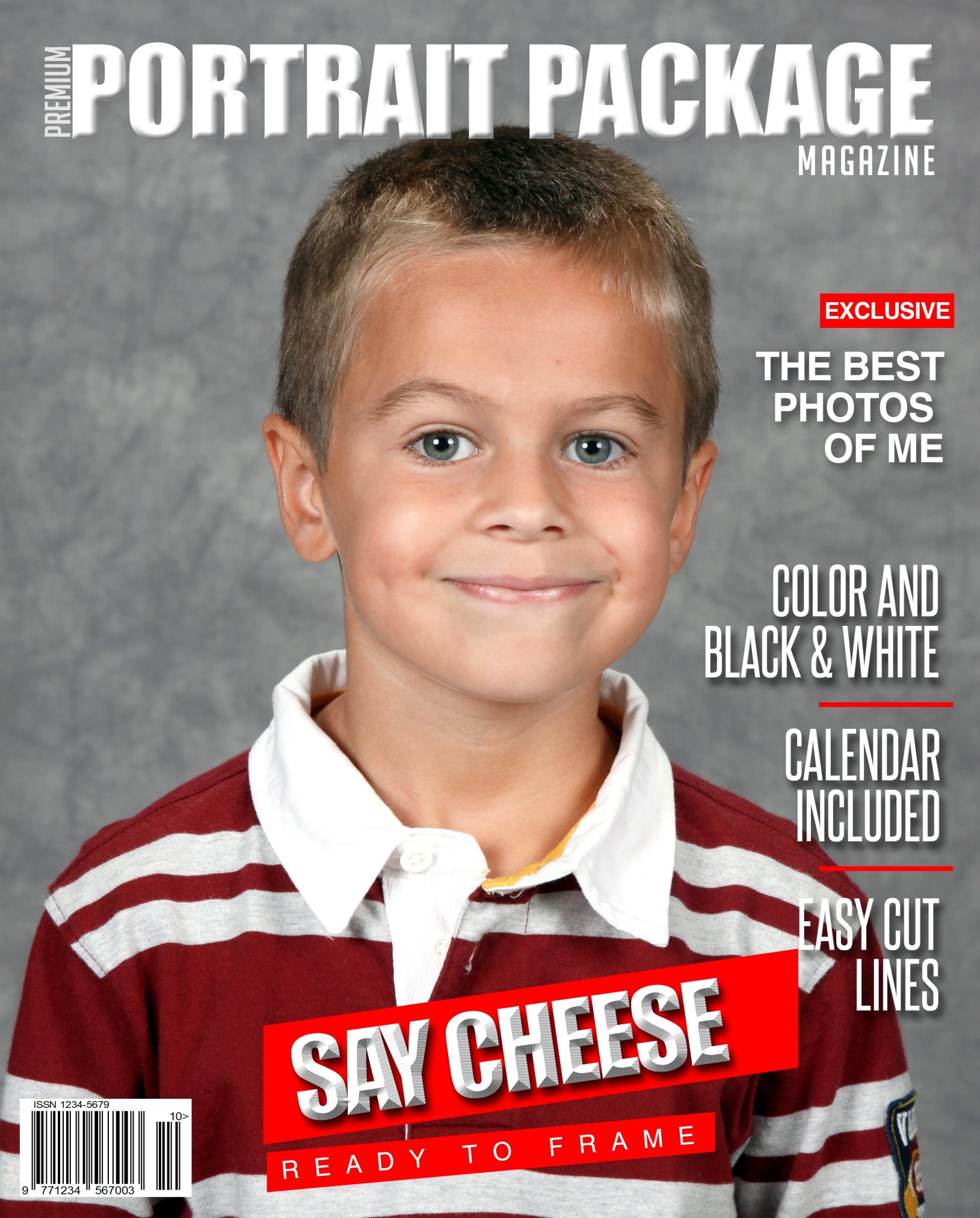
1. A Dazzling Magazine Cover

At the forefront of the Portrait Package Magazine lies its captivating magazine cover. Unlike traditional photo albums or prints, this cover exudes sophistication, giving your memories the grandeur they deserve. It serves as a beautiful introduction, setting the tone for the treasures that lie within.

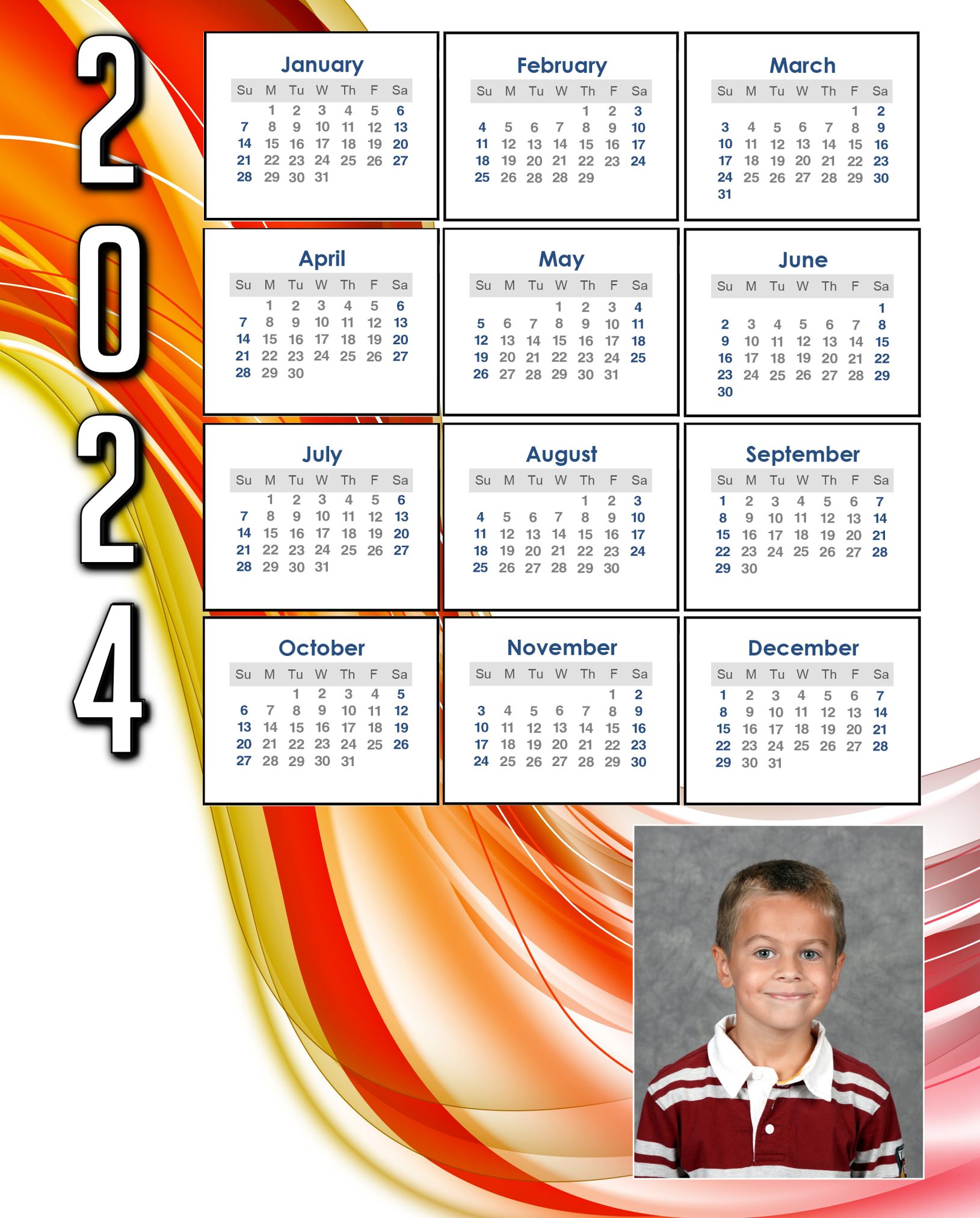
2. A Year of Memories: The Calendar

The integrated calendar ensures that every glance offers a trip down memory lane. Whether hung on a wall or placed on a desk, this calendar seamlessly blends utility with sentiment.

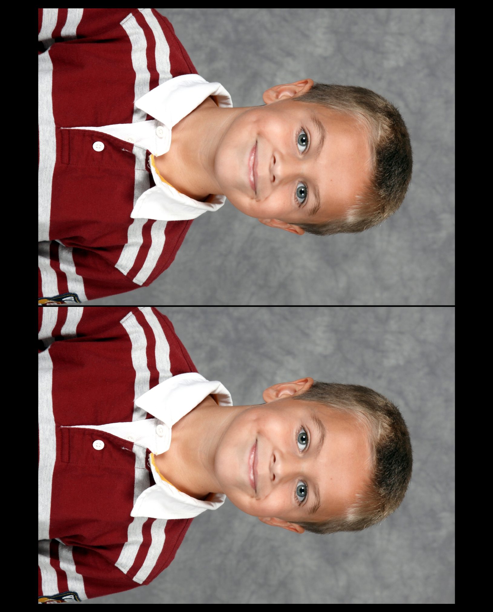
3. Varied Print Sizes: From 8×10 to 8-1/2 Wallets

  • 1 – 8×10: The classic, larger-than-life size perfect for framing and making a statement in any space.
  • 2 – 5×7: Versatile and vibrant, ideal for gifting to loved ones or adorning smaller nooks in homes.
  • 4 – 4×5: Compact yet captivating, these prints are great for creating collages or showcasing multiple memories in a limited space.
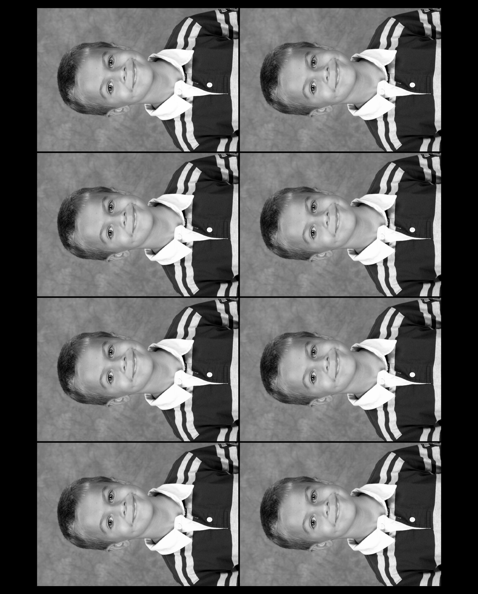
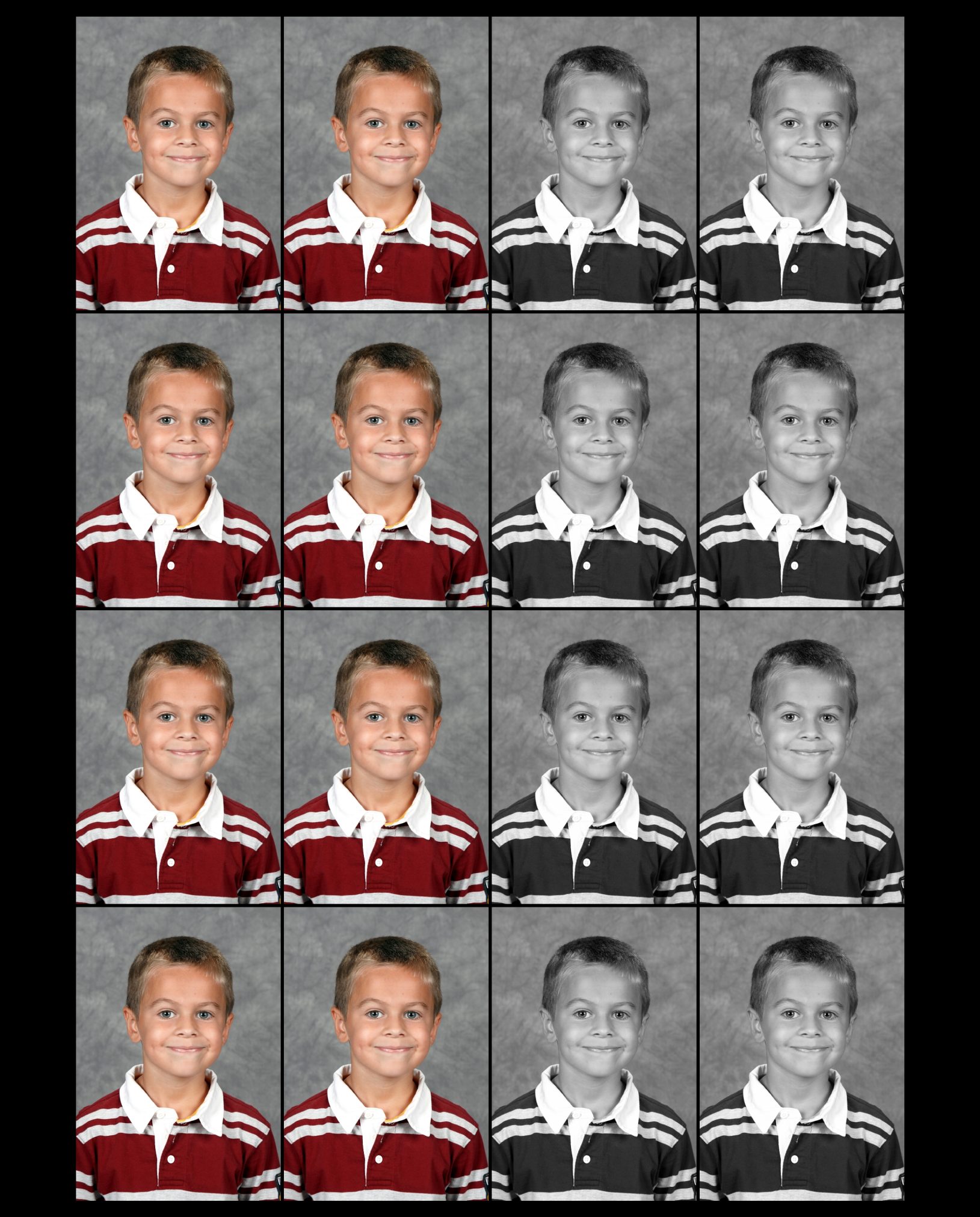
  • 8 – Wallets & 8 – ½ Wallets: These petite prints are perfect for sharing, slipping into wallets, or creating personalized gift sets for friends and family.

4. Press Printed Excellence

Each component of the Portrait Package Magazine is press printed, ensuring unparalleled print quality. The colors are vivid, details crisp, making every photograph a piece of art.